Overview
Hughes diagrams are a type of Venn diagram used to measure the imbalance of discrimination.
Structure
The outer boundary of the diagram is a square that represents the whole population.
The population is split vertically into distinct subsets called “object” groups.
The square is then split horizontally into the affected and unaffected population. The affected population, called the “subject” group, overlaps the object groups.
The varying height of the subject group indicates whether discrimination is biased towards any subset of the population. Since the diagram is to-scale we can measure the difference between groups and quantify the level of unfair discrimination.
Example

The height of each subject group reflects the proportion of children in each ethnic group who are living in poverty. This figure expresses the percentage of the population (a relative measure).
The area of each subject group represents the number of children who are living in poverty. This figure expresses the number of children (an absolute measure).
Relevance
Hughes diagrams are designed to encourage critical thinking.
In the UK in 2020 the Black Lives Matter movement made the news with the headline “black people are twice as likely to live in poverty than white people”.
Some white people, particularly those who grew up in poverty, questioned why the focus is on black people when more white people live in poverty. The answer is easily explained by looking at a Hughes diagram.
While there are seven times as many white people in poverty than black people …

… the percentage of people living in poverty is roughly two times higher in the Black ethnic group.
The two statistics may sound contradictory but do align given that there are thirteen times as many white people than black people in the UK.

Key Concepts
Whole Population
The square should represent the whole population. This may not be every person in the world, but should be every person relevant to the chosen subject.
E.g. a diagram showing child poverty in the UK should include all children in the UK.
The key purpose of this step is to consider the subject of the diagram and choose the population relevant to that context. You should avoid limiting the scope to generate a specific comparison.
E.g. the headline “black children are twice as likely to live in poverty than white children” provides no insight into the level of poverty in other ethnic groups.
Subject Group
The subject of the diagram divides the population into two groups - affected and unaffected.

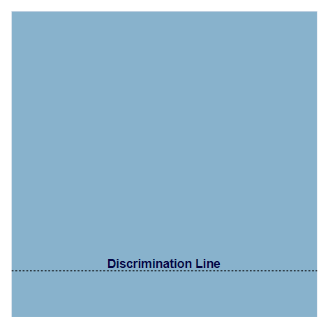
Discrimination Line
The line above the subject group is called the discrimination line.

Subject Scale
The y-axis can be used to measure discrimination.

Discrimination Baseline
Where the discrimination line crosses the y-axis, gives us the baseline for the whole population.

Object Groups
The whole population can be split into vertical groups.

Discrimination Value
Where the discrimination line crosses the y-axis, gives us the amount of discrimination for that group.

Discrimination Offset
The difference between the discrimination value and the discrimination baseline is the bias for that group - aka the amount of unfair discrimination.

Nomenclature and Origin
Hughes diagrams are named after Mrs Jackie Hughes, a school teacher in Birmingham, UK.
Through the mid-late ‘80s Mrs Hughes taught her class of 10-year-old pupils about feminism, sexism, racism, bias, prejudice and stereotypes. I was one of her pupils and named the diagram after my feminist school teacher who so profoundly taught me the concepts of discrimination.
During the Black Lives Matter movement in 2020, I created the first Hughes diagram to visualise the relative difference and absolute difference in poverty across ethnic groups. I started with a Moran diagram and then extended the diagram to display/compare more than 2 population groups.
Hughes diagrams show quantitative data and therefore are technically a type of chart. However, the most notable aspect of a Hughes diagram is the visualisation of groups within a population and how those groups overlap. This is akin to a Venn diagram, hence the name “diagram” over “chart”.